There are 3 major types of expert advisor performance charts. It is very important to be able to identify them to avoid dangerous Expert advisors. This also can apply to signals or manual trading performance.
The first type is the "perfect one". It is looking awesome. It is going only up, there are no losing trades. It is the holy grail.
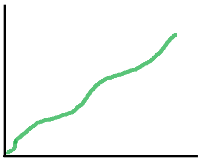
Unfortunately, this is hiding a huge risk. The major way to achieve that nice performance is not to close when loosing. When the market makes a big move against the expert advisor or trader, it looses all, and then the picture starts looking like this. Another way to achieve that is to open trades with very small take profit and huge stop loss. Eventually, the stop loss will be hit one day, but sometimes this can not happen for several months and this will result in an awesome chart. Sometimes they are calculated to handle 1 big stop and continue. Unfortunately, several stops can happen in a row and things can go very very bad. The risk is too big, and you should avoid such systems.
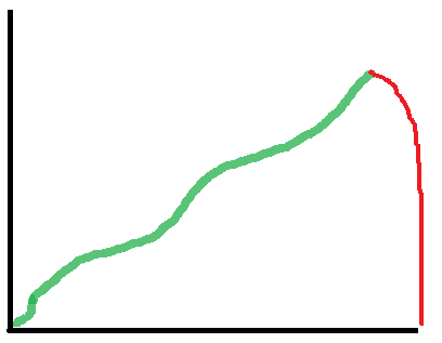
The picture above is showing the future of all perfect holy grail trading robots. It may not happen immediately, but it will happen sooner or later. It is inevitable- this is the lifecycle of all trading systems of that type.
The second type we will call the staircase. It is not exactly a staircase, but it is very similar. It is coming down and then there is a spike that is higher than the loss accumulated before.
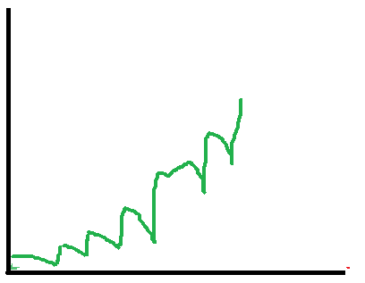
The danger is hiding in the way this is achieved. Usually, this can be achieved in 2 ways- using money management or averaging. These methods by themself are not dangerous, but the problem is that they are used in a countertrend situation. Eventually one day there will be a trend, Bigg enough to lose all the capital. There are several trends every year, so such systems can live up to 7-8 months before they go broke.
The most important question is how the real expert advisor should look like. The answer is simple - it is ugly. There are wins, losses, stagnation, drawdown.
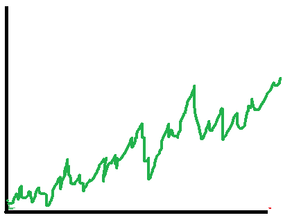
There are periods when it is wining, there are periods where it is loosing. It can be wining in range, or it can be wining in trend. In the opposite period, it is loosing. But there are no huge losses, the risk is monitored and there are always stops. Unfortunately, the result performance chart of the expert advisors is not good enough for beginners and they prefer to use the risk accumulating systems we talked before.
One of the most important things is to make sure that the trading system is closing losing trades. If you can't see losing trades closed- stay away. Such systems will accumulate huge losses, and sooner or later will wipe the account.
The other thing to check is money management. The system may close losing trades, but after that can open with double capital like Martingale. So if it is increasing significantly the capital after loss, it is not a good idea to use such a trading robot.